LRPS Panel, Royal Photographic Society…
Last year an urge overcame me – something to do with middle age I guess – where I wanted to receive recognition for my photographic ability with the world renowned Royal Photographic Society, and so I made a decision to join their illustrious organisation and begin a process of becoming the best I can be and aiming high to try and become a Fellow of the RPS.
They Royal Photographic Society of Great Britain – RPS for short – are one of the World’s oldest photographic institutions initially formed in 1853 in London, England. They received Royal Patronage by Queen Victoria and Prince Albert in 1854 and continue to support photography and photographers of the highest level as well as encouraging photographers of all abilities to continually improve their skill sets through Online learning and workshops that they provide across the country. This is all geared towards photographers pursuing the Distinctions and receiving letters after their name if they are successful at achieving the high standards of excellence that the organisation strictly adhere too: Licentiate, Associate and Fellow of the RPS – LRPS, ARPS, FRPS…
Among their personnel is Steve McCurry, Hon FRPS – My favourite photographer.
They are also a Charity too and an organisation I firmly believe in…
Royal Photographic Society Website
LRPS Panel…
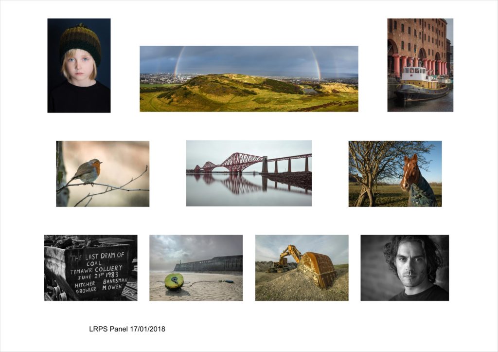
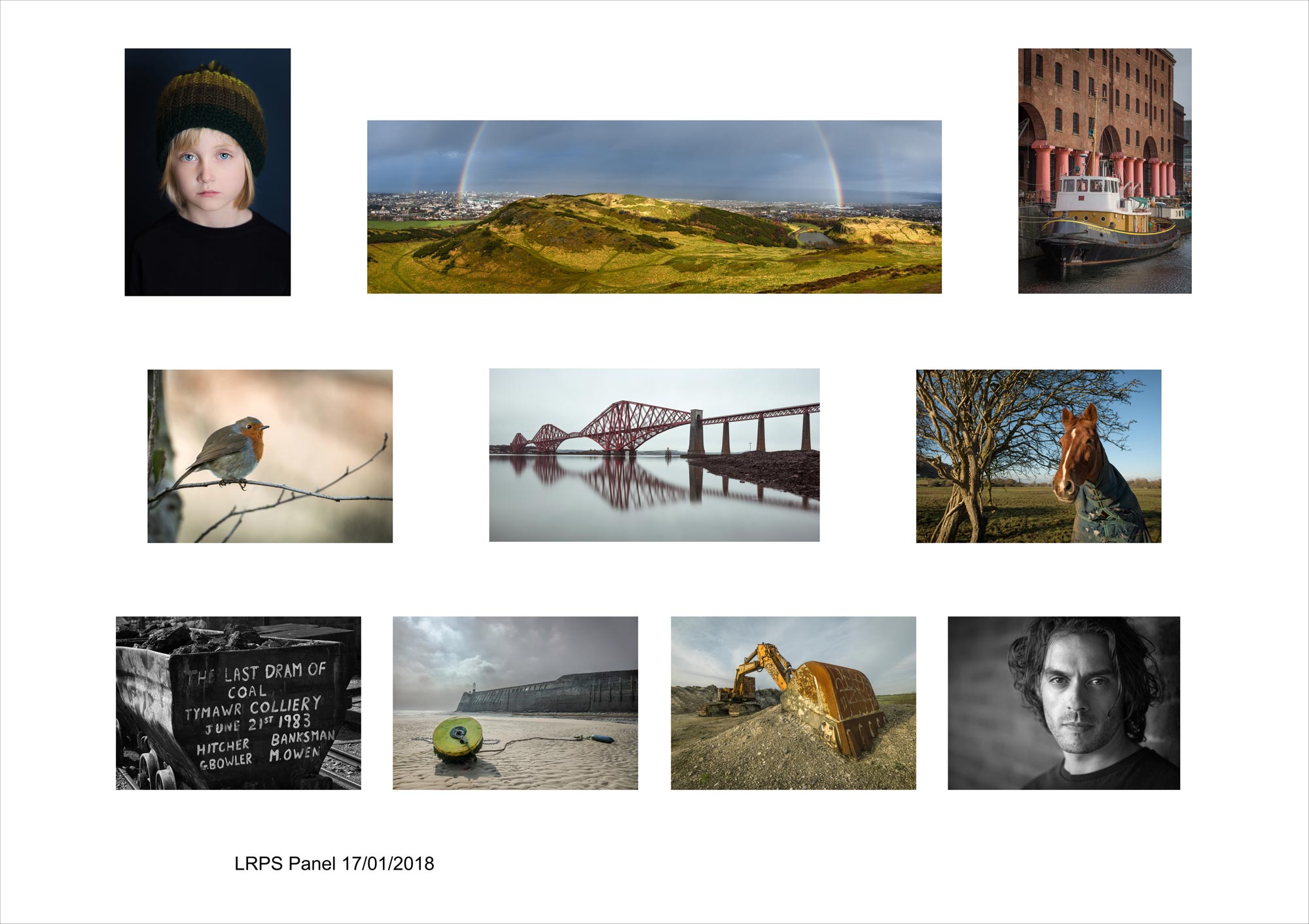
The above is my LRPS Panel which I submitted on the 17th of January, 2018 at Fenton House, Bath after undertaking a 7:00am drive from a cloudy Bridgend, Wales with my wife and constant supporter.
The images of the Distinction Awards are judged on certain key criteria and all images must meet the exacting standard for the panel to be successful. There is no concept needed for the LRPS Distinction, but a wide range of ability must be demonstrated in the images/photography and the overall set need a unifying cohesiveness to their look and presentation and are often referred to as the Eleventh Image… This is a Key Concept to passing!
The judges have a set of criteria and all these must be met if you are to be successful: No highlights blown, no shadows blocked, strong visual awareness, excellent composition, no banding, no aberrations, strong focus, excellent editing, professional presentation, excellent printing skills, wide range of skill set and lots more.
It’s a tough award to achieve and my advice for anyone wanting to is practice, practice and practice, learn, learn and learn, study, study, study and above all not give up or be afraid to seek professional opinion of which the RPS holds Distinction Advisory days to see if you are on the right track.
It does takes time to learn the necessary skills, perhaps years, but perserverance and stubbornness are your allies, and while I never attended the advisory days I am unremittingly stubborn in my pursuit of perfection, but will certainly seek advice as I undertake my ARPS.
How I chose the Final LRPS Panel…
I worked a few months on my panel and rejected dozens of shots as I created countless contact sheets in Photoshop to view the panel as a whole and see if it worked as a whole. In the end it came down to me choosing perfectly exposed, sharp, zero blown highlights, zero blocked shadow images and no technical issues that also show a range of skill sets. In short I played a little safe in my selection and chose images which never danced on the edges of the histogram as blown highlights are a big no-no with the judges.
Perhaps the biggest?
I finally selected the above range to include, portraits, landscapes, wildlife, wide-angle shots, fast and slow shutter speeds and colour and B&W. After my selected images I will show a few rejects at the bottom, but in the panel I did want to include an image with movement and a macro shot, but never quite found ones that worked. In the end I chose two portraits to be diagonally opposite each other with two industrial images taking the other diagonal spots. Landscape panoramas took central positions and I liked the way the bird and horse look at each other as they surrounded one of the panoramas. I also chose two wide angle shots of a buoy and digger and positioned them next to each other with them revealing a hint of yellow – Two B&W images flank the wide angle shots on the bottom rows. Also included are two portrait crops to mirror each other on the top row, as well as the corner images looking slightly inwards. Three rows also seemed a natural decision due to the panoramas width…
It was in many ways a technically safe panel…
It was well received overall with one judge saying the horse image didn’t work for him, whereas another judge had the opposite viewpoint and said it was bold and brave to stand so close to a horse with a wide angle lens and showed an empathy from the photographer – One Man’s Wine…
The Chosen Images…
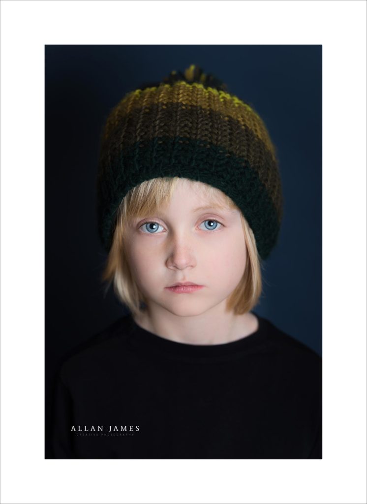
Image 1 – Riley
A studio image taken during a Model Portfolio shoot…
More about Riley can be found by clicking here…
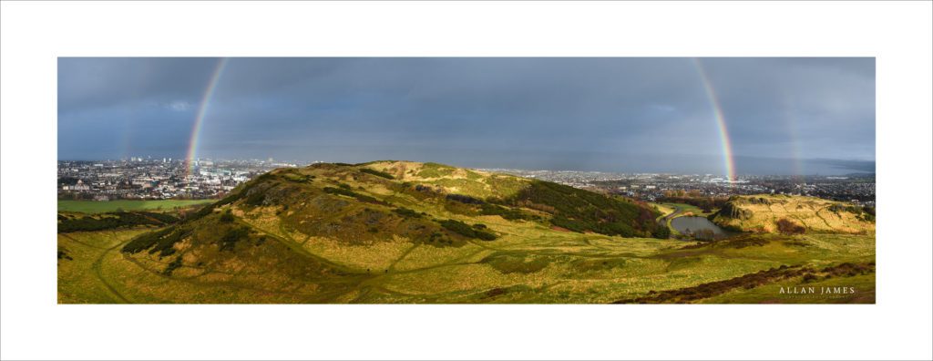
Image 2 – View from Arthur’s Seat…
Stitched panorama of six handheld shots taken on New Year’s Day from Arthur’s Seat, Edinburgh when a surprise double rainbow appeared after a brief shower. I have to credit my wife who insisted I try a panorama…
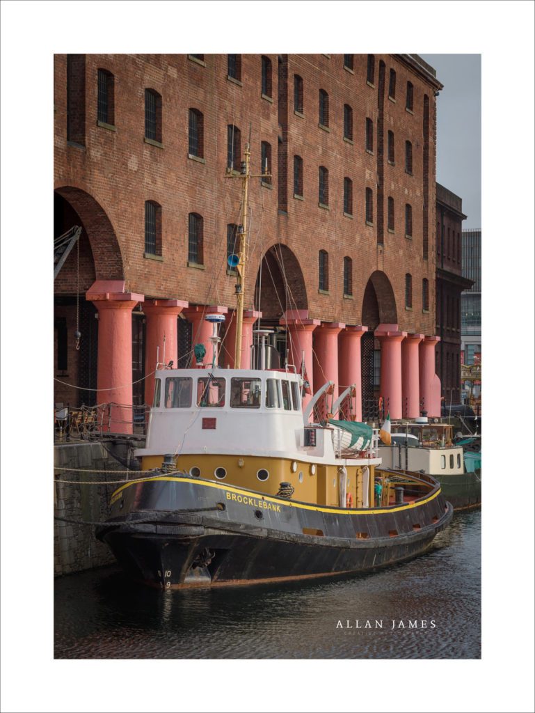
Image 3 – The Brocklebank…
This was taken at Albert Docks, Liverpool and I must admit I got excited when I saw this boat and the contrast the pillars provided. A static image and one I knew had to be in a Portrait orientation…
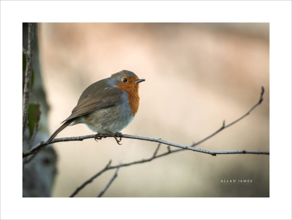
Image 4 – Robin Redbreast…
The panel consists of experts across varying genres, but you can bet your bottom dollar that Wildlife and Landscape will be included so in my opinion it’s not a bad thing to include a few birds and animals. Bird photography represents one of the hardest genres and I spent a few hours out in the field searching for the right image, but luckily a few weeks ago I saw a Robin sitting in a tree for a few seconds and managed to get off two exposures before he flew away…
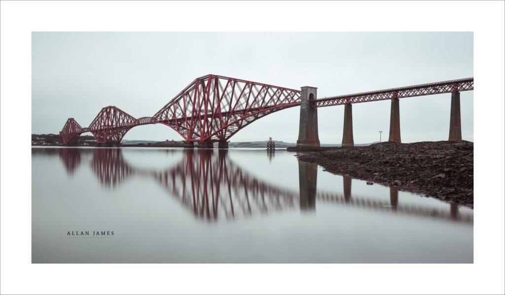
Image 5 – The Forth Rail Bridge…
This image took two attempts on a recent trip to Edinburgh. I used a slow shutter speed and a Lee Six Stop to get a still reflection in the water, but on the first sunrise visit there was a strong back lit sun and I couldn’t quite get rid of a slight red cast in the first image. Luckily, the next day was quite grey and overcast and so with less contrast in the scene I was able to get the shot I originally envisioned.
When I mounted this shot I realised that any blown highlights in any submitted images would quickly show up by being brighter than the white mounts and so obviously aid the judges in spotting blown highlights. The white mount shows off the greyness of a Scottish day, but before the print was mounted the water looked bright on my screen – The white mount showed it too be a bright grey…
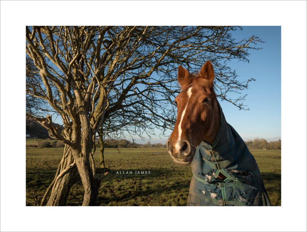
Image 6 – The Horse and the Tree…
The only image which raised a question mark, albeit in only one judge, who said it was boring in relation to the other images. Yet, at the end of the day the images must be judged on technical merit and not taste, although it must be difficult for a judge to not be influenced by taste?! Having said that another judge thought it was a brave choice that showed great empathy with my subject…
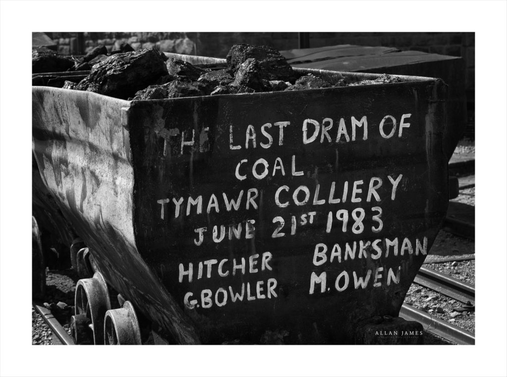
Image 7 – The Last Dram of Coal…
A B&W image taken a few years back that I’ve always been drawn too due to the power of the words – Taken at Rhondda Heritage Park, South Wales…
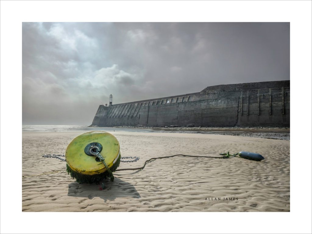
Image 8 – Porthcawl Buoy…
Taken with a wide angle lens at Porthcawl, South Wales. I’ve always liked the depth in this shot and the way the wall leads to the Lighthouse and sea…
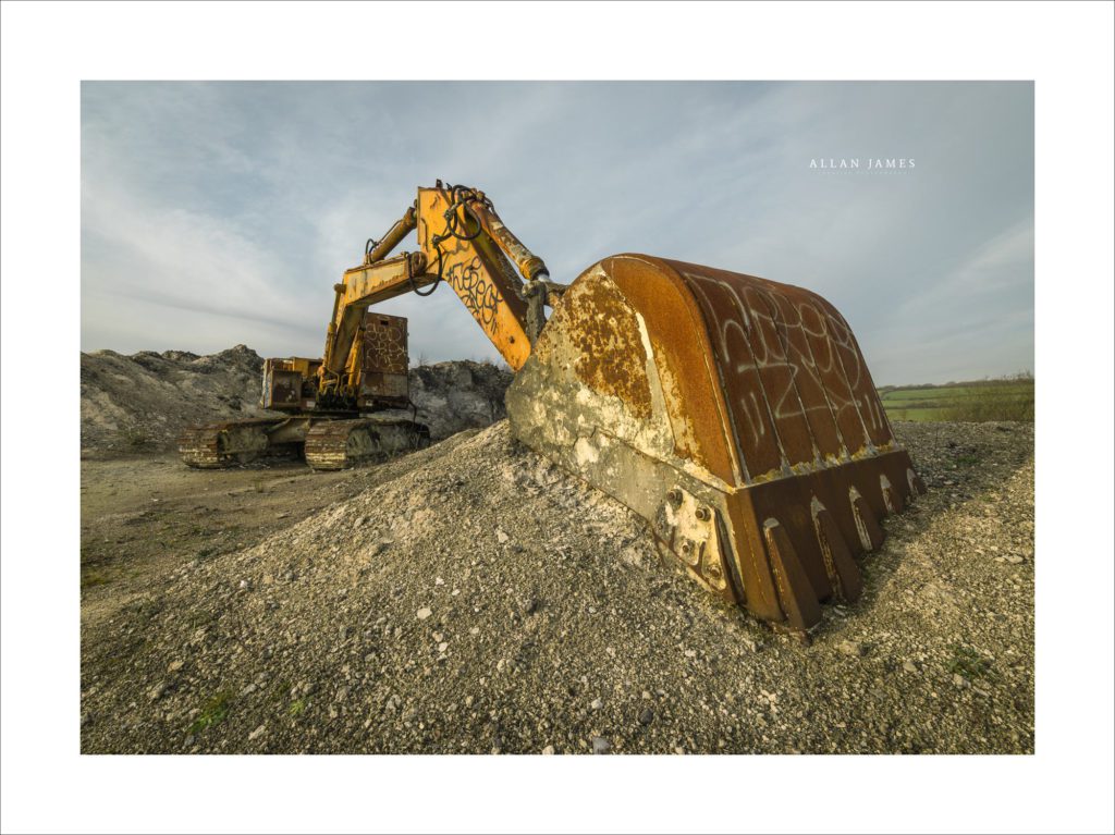
Image 9 – The Digger…
An image I purposely went for when I decided on the buoy as I knew it would mirror it? The is an abandoned quarry in Pyle, South Wales. I captured a few angles of this shot, but in the end the one I chose emphasised the size of the digger bucket and allowed the rest of the machinery to fall away…
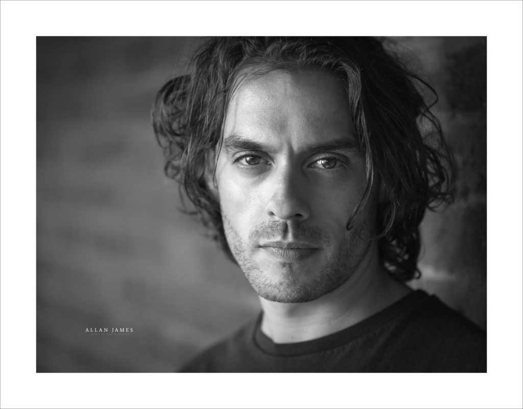
Image 10 – Francois Pandalfo, Actor…
This was an image taken during an On Location Actor’s Headshot session with Francois Pandolfo who has starred in Doctor Who and Eastenders and has his own Theatre Company based in Cardiff. It is a flash shot taken with a silver umbrella in a bounce position to the side and shows strong shadow and light as well as shallow depth of field…
More can be read about Francois Here…
These were the shots I finally settled on and yes I would have liked to have included a macro shot, and an image with movement, but I stuck to my guns, played safe rather than flash, kept bright highlights under control, perservered with the choices and was awarded the LRPS letters after my name…
Below are a few images I rejected and the reasons why…

Rugby…
Desperately wanted to include movement. I would have liked the runner’s whole body sharp rather than the head, but I’d chosen two portraits with strong eye contact and didn’t want another portrait in the panel…
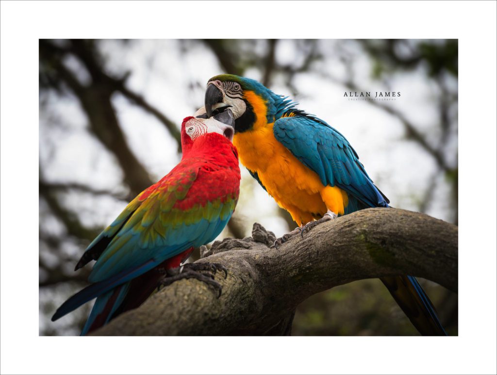
The Parrots…
There was strong backlight in this image, but in order properly expose the parrots I had to slow the shutter speed down and so the sky received too much exposure time. Difficult in the circumstances to meet the RPS criteria but artistically correct. I hung on to this image for a while for emotional reasons, but in the end the sky danced on the edge of the histogram and could be so easily viewed as blown…
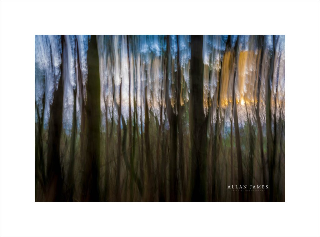
A Photographic Monet…
The histogram of this image never clips, and yet I never risked it due to the white sky potentially being viewed as being blown. Not sure if it is a correct decision, but as I have said before I played my images safe with regards to the histogram and a judge could quite easily say it’s got blown highlights, although I believe they are not – Not worth the risk, but an image which showed movement…
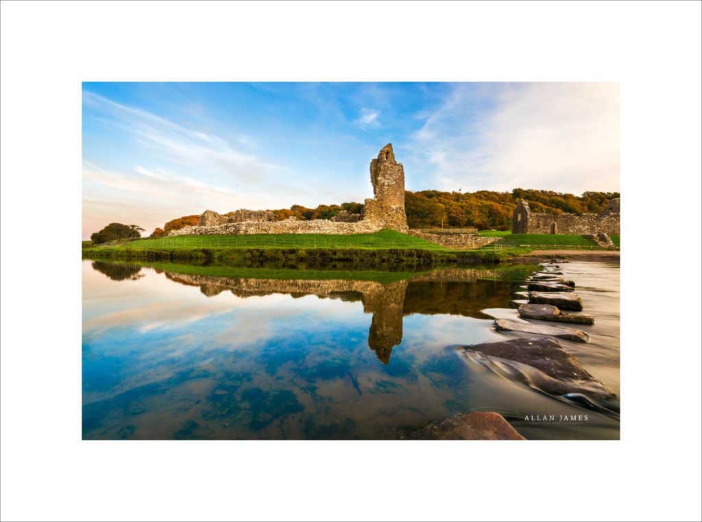
Ogmore Castle Reflections…
This was taken a few years back with a crop sensor camera. I’ve tried to replicate the image with a Full-Frame camera, but have never had the same light on my subsequent visits. There are two faults for me here. I feel I may have saturated the blues a little too much for effect and I think due to the crop sensors limited dynamic range there is a sharp transition between the different shades of blue – Banding…
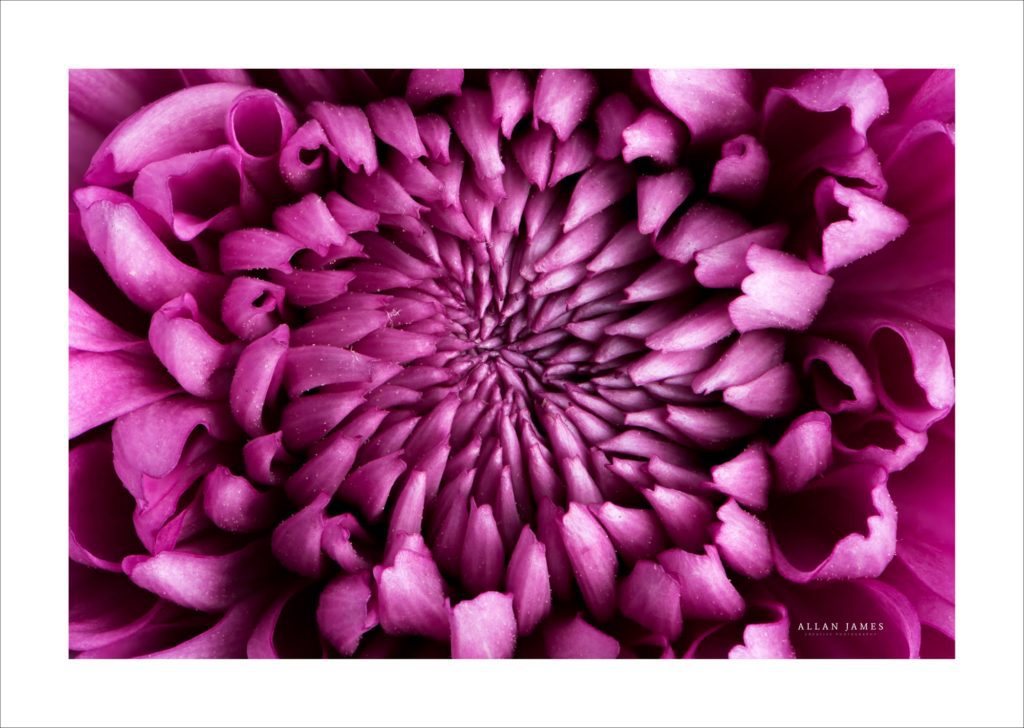
Chrysanthemum…
Although all on the histogram though wide in distribution, it never fully fitted the panel to my eye… Macro shot…
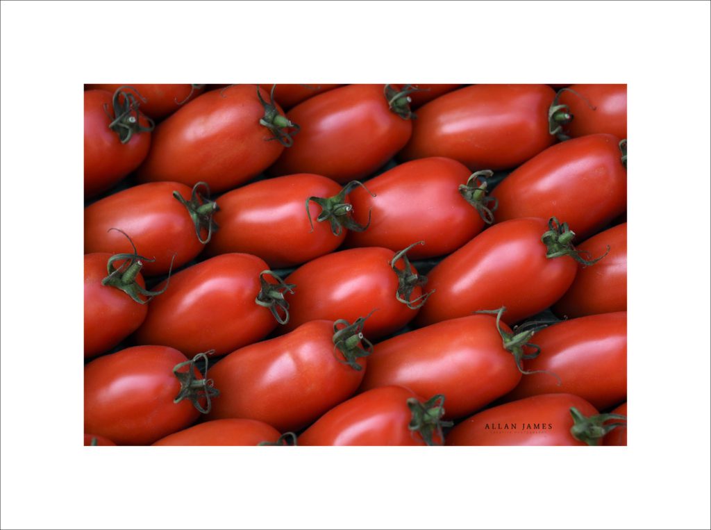
The Tomatoes…
An image I rejected due to the colour standing out in the panel and the storks on the edge being soft in focus. This was taken a F/4, but on reflection if I could go back I would take it at F/8…
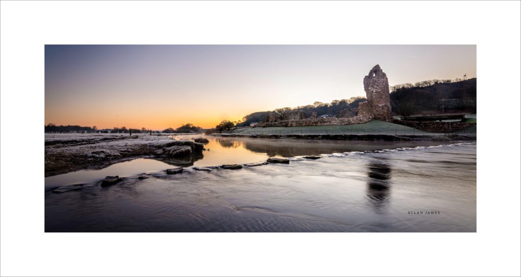
Ogmore Castle at Sunrise…
This was in until the printing revealed a little bit of banding in the sky where the orange moves to the greyish sky…
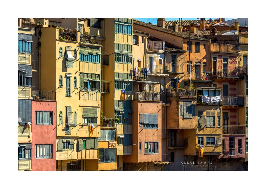
Girona, Spain…
I liked the idea of a travel photo, but I have circled an area with a blown highlight on a highly reflective blind. I could have fixed this with some detailed work, but perhaps there would have be tell tale signs to an expert…
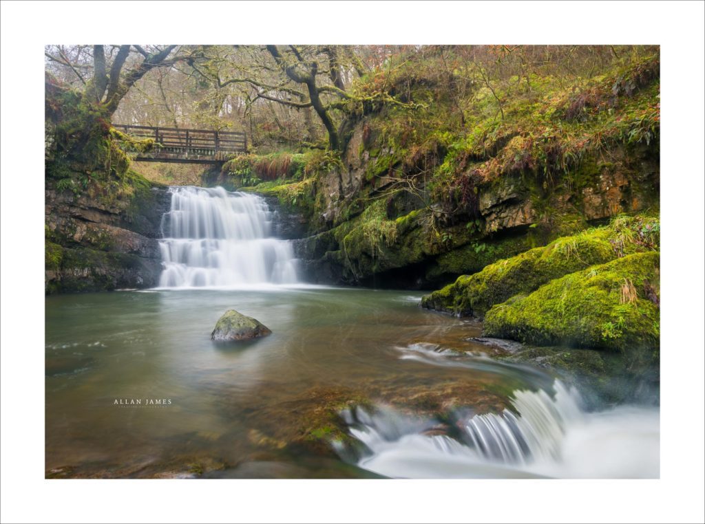
Dinas Rock, Pontneddfechan, South Wales…
Another image showing movement. There were two panels that failed and both had waterfalls in them. I’d read a lot online about the water often being viewed as blown by some and acceptable as a milky white effect by others. Also, one judge at the panel said a waterfall had blown highlights while the next judge said it was acceptable to his eye… Again playing safe and not worth the risk for me…
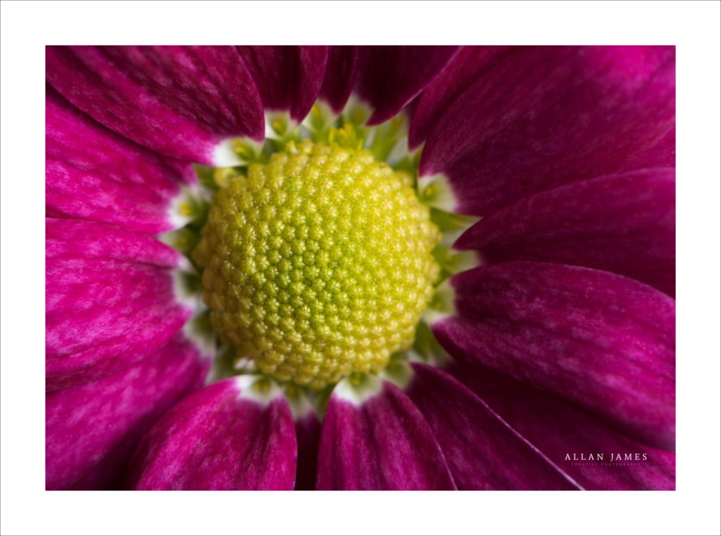
Flower…
An image I chose against for nothing other than a gut instinct…
I’ve said it a couple of times I played it safe with my panel, but I was rewarded with a Licentiate of The Royal Photographic Society, but fortune favours the brave as long as you don’t step over that histogram…
Good Luck and don’t be afraid to email if you have a question…
On Location and Studio photographer based in Broadlands, Bridgend and serving around Bridgend, Cowbridge, Porthcawl, Maesteg, Ogmore, Llantrisant, Swansea, Neath Port Talbot and Cardiff…

You must be logged in to post a comment.